GUND X Disney

Repositioning GUND Through a Premium Disney Partnership
The Opportunity
GUND partnered with Disney for the first time—an important moment to redefine how the brand shows up.
Historically, GUND leaned toward a more traditional, product-focused aesthetic. With this collaboration, the goal was to elevate the brand visually and connect with a new audience: millennial parents who value design, storytelling, and emotional connection.

The Insight
Millennial parents don’t just buy toys—they buy experiences, nostalgia, and meaning.
Disney already owns emotional storytelling. The opportunity was to position GUND not just as a plush toy brand, but as part of a modern, design-forward lifestyle that fits naturally into the home and everyday moments.
The Idea
“Soft Moments, Thoughtfully Styled”
Create a visual world where GUND x Disney feels elevated, warm, and intentional—less like a toy brand, and more like a lifestyle brand rooted in comfort and storytelling.
Creative Direction
As Art Director, I developed the overall look and feel of the lifestyle photography to support this shift.
This included:
Establishing a refined visual language (soft neutrals, natural light, elevated environments)
Directing photography to feel authentic, candid, and emotionally driven
Styling scenes that reflect real family moments, not staged product shots
Ensuring the Disney IP felt integrated, not overpowering
The goal was to create imagery that felt at home in:
Modern interiors
Social content
Retail environments
Execution
I led art direction across the shoot from concept through final imagery:
Developed mood boards and visual references grounded in audience and brand research
Directed lifestyle photography on set, guiding composition, lighting, and tone
Partnered with production and cross-functional teams to ensure consistency across outputs
Delivered a cohesive visual system that could scale across:
Digital campaigns
Retail
Social
The Outcome
The final work positioned GUND as a more modern, elevated brand, while maintaining its emotional core.
Strengthened the visual alignment between GUND and Disney
Created a scalable lifestyle system for future campaigns
Shifted perception from traditional toy brand → design-conscious lifestyle brand


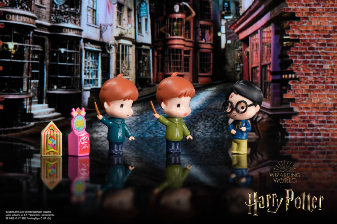
Wizarding World
Evolving a Franchise Aesthetic for a New Generation
The Challenge
By the third season of Wizarding World, the visual direction was already established—rooted in the early Harry Potter films:
Clean, studio-based environments
Traditional school uniforms
Bright, evenly lit compositions
However, the franchise itself had evolved. Beginning with Harry Potter and the Prisoner of Azkaban, the tone shifted:
Lighting became more moody and cinematic
Characters moved toward individual expression through wardrobe
The world felt more grounded, textured, and emotionally complex
The challenge was to modernize the brand aesthetic while maintaining continuity with what had already been established—and ensuring it resonated with both:
A new tween audience
Longtime fans and collectors
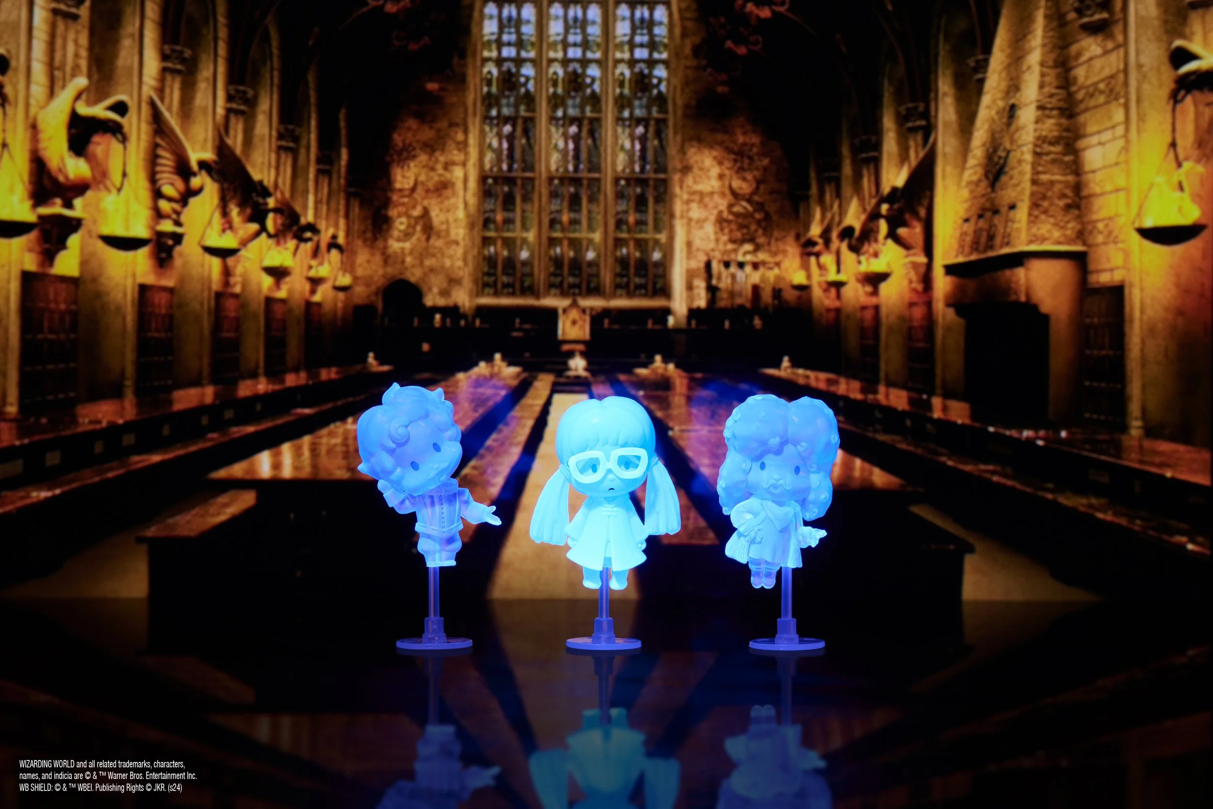
The Insight
The Wizarding World grows with its audience.
To stay relevant, the visual identity needed to reflect a more mature, immersive version of the world, while still retaining the recognizable elements that fans expect.
The Idea
“A World That Evolves With You”
Shift the visual language from staged and youthful to cinematic and atmospheric, creating a bridge between early nostalgia and a more mature, story-driven experience.

Creative Direction
As Art Director, I evolved the look and feel of the brand to align more closely with the tone introduced in later films—while maintaining continuity with earlier seasons.
This included:
Introducing moodier, directional lighting to create depth and atmosphere
Moving away from strict uniforms toward layered, character-driven styling
Incorporating more textured environments and natural compositions
Balancing cinematic tone with approachability for a younger audience
The goal was to create imagery that felt:
Authentic to the films
More emotionally engaging
Visually elevated for collectors and long-time fans
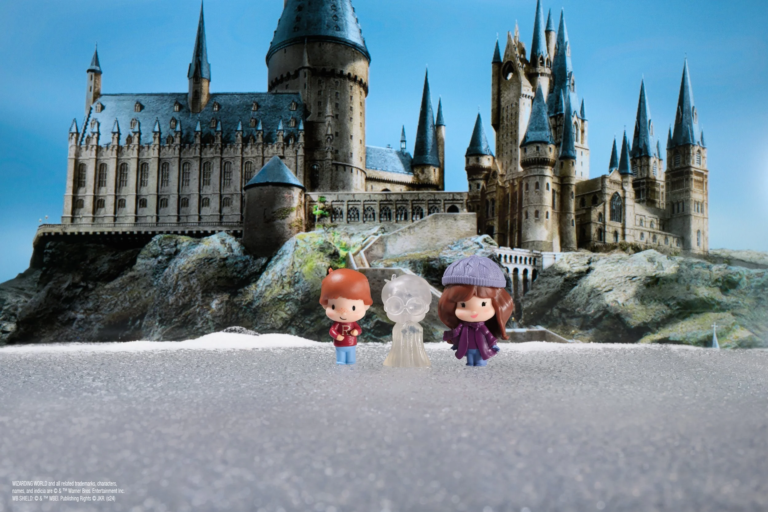
Execution
I led the art direction across lifestyle photography and visual development:
Developed updated mood boards and visual references rooted in film evolution
Directed on-set photography, guiding lighting, composition, and styling
Ensured continuity across seasons by blending legacy elements with new direction
Collaborated cross-functionally to maintain alignment across product, marketing, and brand teams
The resulting system allowed the brand to evolve without losing recognition.
The Outcome
The updated visual direction successfully bridged two audiences and two eras of the brand:
Created a more cinematic, immersive aesthetic aligned with the Wizarding World universe
Increased relevance with tween audiences while deepening appeal for adult fans and collectors
Established a scalable visual system for future seasonal campaigns


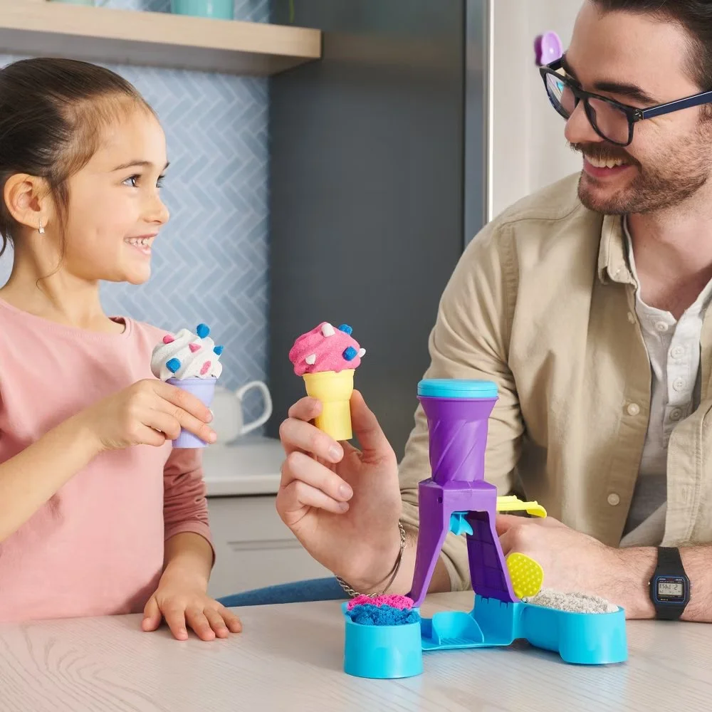
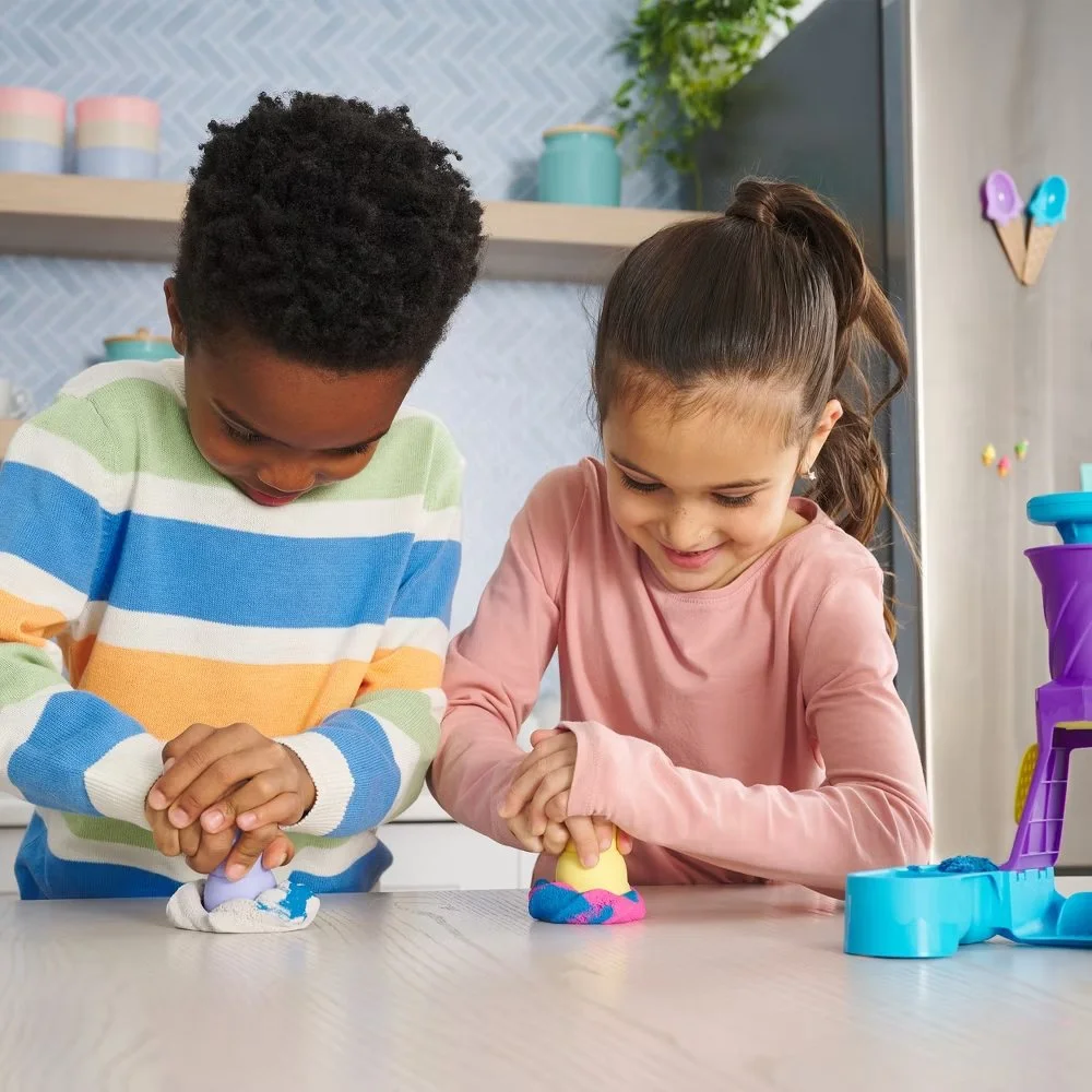
Kinetic Sand

Reframing Play: From Solo Activity to Shared Family Experience
The Challenge
Kinetic Sand was primarily positioned as a solo children’s activity, with visuals focused on kids independently playing with the product.
At the same time, the brand faced a key perception barrier:
Concern that the product would be seen as messy or difficult to manage
The directive was twofold:
Expand the narrative to show Kinetic Sand as a shared family experience
Reinforce that the product is clean, controlled, and easy to use and store
All while maintaining strict visual discipline:
Clean sets
Contained product
No sense of mess or chaos
The Insight
Parents are more likely to engage with products that feel:
Safe and manageable
Easy to integrate into everyday routines
Shared, not isolating
To shift perception, the product needed to feel less like “playtime mess” and more like a contained, intentional activitythat works for both children and families.
The Idea
“Creative Play, Without the Mess”
Position Kinetic Sand as a structured, satisfying, and shared experience—where creativity happens within a controlled, beautifully presented environment.
Creative Direction
As Art Director, I evolved the visual language to support both family interaction and product control.
This included:
Introducing family presence to shift from solo to shared play
Designing scenes that highlight ease of use, cleanup, and storage
Using a light, clean color palette to reinforce clarity and control
Directing lighting to feel bright, soft, and inviting
Meticulously styling the sand to always appear contained, sculptural, and intentional
Every detail was considered to ensure the product felt:
Approachable for parents
Engaging for children
Visually calm and controlled
Execution
I led art direction across lifestyle photography from concept through final delivery:
Developed mood boards and visual frameworks rooted in product benefits and audience needs
Directed on-set photography, focusing on composition, cleanliness, and product clarity
Styled product interactions to emphasize ease, structure, and satisfaction
Collaborated cross-functionally to ensure alignment with brand priorities and product messaging
The result was a cohesive visual system that could scale across:
Packaging
Digital campaigns
Retail environments
The Outcome
The updated direction expanded how Kinetic Sand could be perceived and used:
Successfully introduced family-oriented storytelling into the brand
Reinforced the product as clean, controlled, and easy to manage
Created a scalable visual approach that balanced creativity with structure
Helped shift perception from “messy play” → “contained, satisfying experience”

Creative Decks
for access to PDFs please contact us at ymorrmill@icloud.com
Primal Hatch
coolmaker